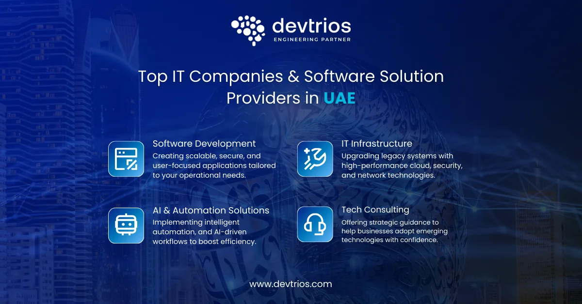
Top IT Companies & Software Solution Providers in UAE
Explore leading IT firms in UAE for cloud, AI, software development, and managed IT services. Compare top IT companies in Dubai and UAE for 2026.
Explore leading IT firms in UAE for cloud, AI, software development, and managed IT services. Compare top IT companies in Dubai and UAE for 2026.
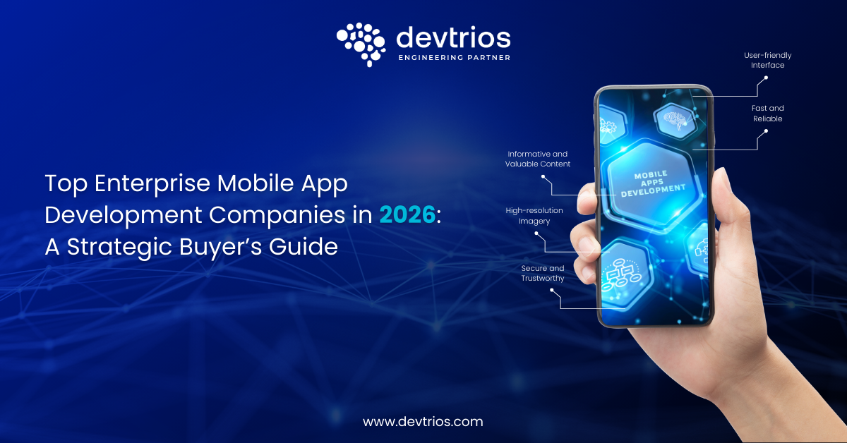
Discover the top enterprise mobile app development companies in 2026. Compare capabilities, costs, security standards, AI expertise, and integration strengths to choose the right strategic partner.
Discover the top AI app ideas for 2026. From health monitoring to smart automation, learn how to build, monetize, and scale the next big AI startup.
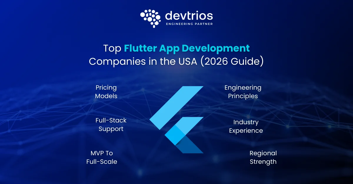
Discover the top US Flutter app development companies for 2026. comprehensive guide for CTOs on costs, Flutter 4.0 trends, AI integration, and why Devtrios leads the pack.
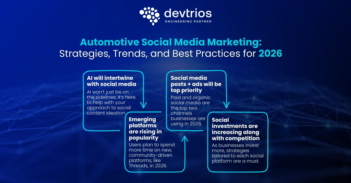
Learn how top car brands and dealerships use social media in 2026 to generate leads, boost engagement, and increase sales with data-driven strategies.
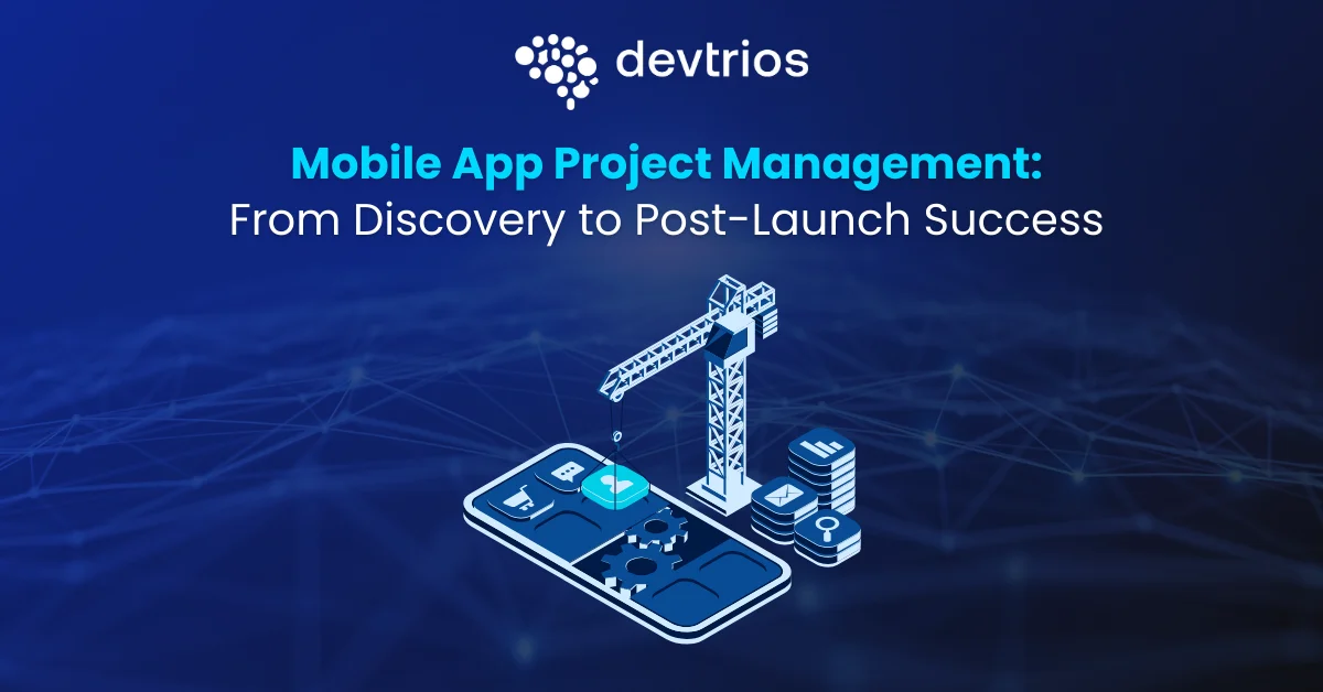
A practical guide to mobile app project management, covering discovery, planning, Agile delivery, QA, risk management, and post-launch optimization for successful app outcomes.
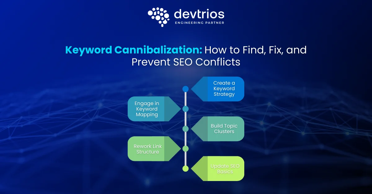
Learn how to find, fix, and prevent keyword cannibalization. Step-by-step SEO strategies, tools, and real examples to boost rankings fast.
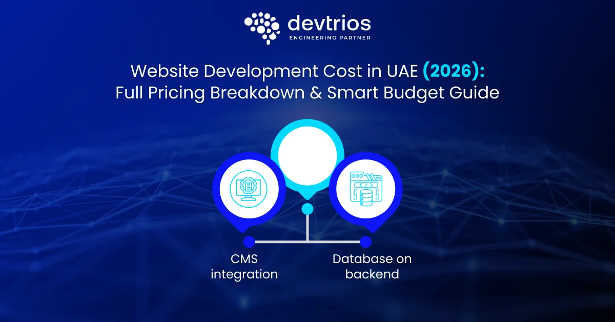
Discover the real website development cost in UAE for 2026. Full pricing breakdown by website type, Emirate, features, timelines, and smart budgeting tips to avoid overspending.
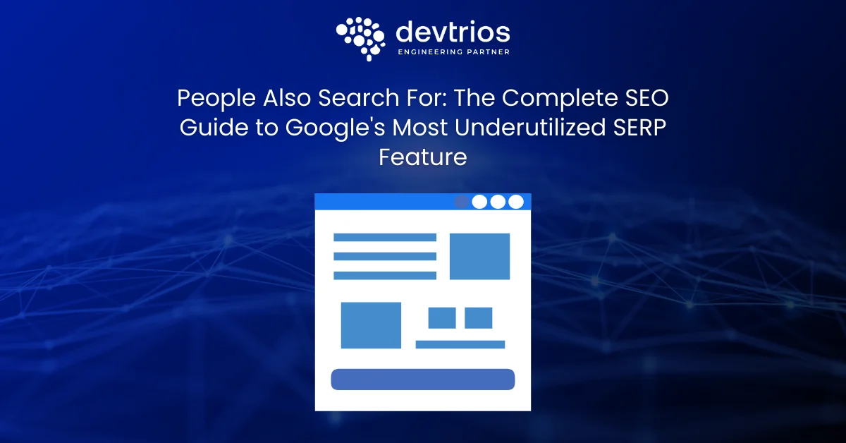
Master People Also Search For (PASF) keywords to unlock SEO opportunities, expand reach, and rank for related searches. Tools, strategies & case studies included.
Master People Also Search For (PASF) keywords to unlock SEO opportunities, expand reach, and rank for related searches. Tools, strategies & case studies included.